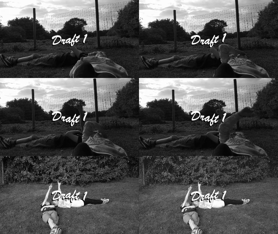
Music Video - Draft 1
Our first draft is quite simply edited, as we wanted to focus on establishing the storyline through shots.
Picking from our vast library of footage was difficult - if Yoli and I were to improve on our preproduction, it would be to clarify and plan in detail the shots we want before we film. The difficulty this year was obviously being in a new location where everyday life in the city could disrupt filming, however, perhaps if we had focused on the shots we wanted of the characters in our music video rather than the surroundings, our planning could have been more efficient.
Things I believe went well in this draft include:
- Narrative of the flashback scene
- The overlays whilst Robyn is studying in school
Things I believe we could improve on:
- Flashbacks could be made more obvious with a filter
- The ocean background is isolated - it may need to be replaced or repeated throughout
- The green screen background isn't aesthetically pleasing
- The 'fairy letters' overlay is too faded - opacity should be reconsidered
- Study scene and statue scene a little too long
- Obvious black line in green screen towards the end of the video (must be blurred)

Comments
Post a Comment