Exploring Synergy in Promotion - The 1975 - I Like It When You Sleep, for You Are So Beautiful Yet So Unaware of It

 Before The 1975 released "I Like It When You Sleep, for You Are So Beautiful Yet So Unaware of It" (I'll call it ILIWYS from now), they were recognised as a band through their monochromic style. As a group they developed, and for their second album they wanted to be seen from a different perspective.
Cue the pink.
"ILIWYS"'s album cover is very similar to "The 1975", except it is in colour, with pink as its focus, rather than black and white. Their sound, a lot more upbeat in general with controversial topics of politics and fame amidst the love songs, made this album demand for attention. The 1975's first album was a huge success, making their second album difficult in terms of improving upon what they had already achieved. To ensure they didn't flop, The 1975 were careful in regards to their marketing strategy. They hid their social media pages for a brief amount of time, before posting cryptic messages and cartoons hinting at the next era to come.
"On 1 June, the band's Twitter accounts were deleted, which caused mass speculation from both fans and media alike that the band had broken up. On 2 June, Healy tweeted again, but revealed a cryptic and symbolic comic strip containing the message that the band had gone on hiatus. A blurred Instagram picture from Healy titled "The 1975-2" set anticipation for release."
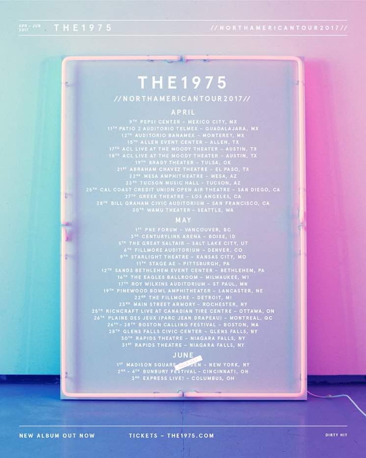
'Love Me' was the lead single from this album, potentially one of the most controversial too, as it slams those acting fake through media. The video, filled with shots of pinks and blue tones, established the colour scheme for the band, alongside its new sound. To market their new album even further, The 1975 toured pop-up shops around the globe, where you had a chance to meet the band, take pictures with the iconic neon signs and buy their merchandise.
Below, I created a collage filled with shots from The 1975s music videos from the "ILIWYS" era, with promotional shots featured on their social media and images from pop-up shops. As you can see, the band use a clear theme of colour to express synergy across their products, whether it be promotional, videos or album cover.
"For each song on the album, a pink neon sign was created and put against various locations to create nostalgia for the song, but to also detail the thematic material and complexity of each song through the photo's atmosphere."
Due to this, when seeing a particular image, you may think of the band, even if it's just through use of colour or a pink, neon sign - it made the band recognisable in a polar opposite way to how they were recognised before. The use of synergy helped build up excitement for the release of "ILIWYS" and the new era of The 1975.
Due to the success of this, Yoli and I will take inspiration from the strategy used to market "ILIWYS", and be sure to use synergy across our products to create an artist that is recognisable from a colour, object or word.
Comments
Post a Comment